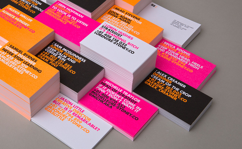
Every time you hear someone say “May I have one of your business cards?” you should get excited. I know I do. That’s because I LOVE my cards. I spent thousands of dollars on printing, several hours on designing and went through 10 different layouts until I got them right.
And it was all worth it.
A business card is an entrepreneur’s best friend, his most valuable marketing tool and an essential element to becoming UNFORGETTABLE. Unfortunately, too many people have business cards that simply blend into the multitude of cookie cutter crap. And that’s a shame, because a business card is more powerful than you think.
Of course, it’s impossible to know this unless you actually have a card that’s really, really good. Therefore, this article will examine The Four Corners of Unforgettable Business Cards:
- Stacking Up
- Standing Out
- Creative Enhancement
- Implementation
CORNER #1: How Does Your Card Stack Up?
Think back to the last trade show, networking event, seminar, convention, social hour or association meeting you attended. How did people react to your business card? Did they complement its design? Quickly shove it into their pocket? Show it to someone else? Rip it up?
Whatever the response was, your card made some type of impression. But only the most creative, unique and memorable business cards make UNFORGETTABLE impressions. And those types of cards elicit reactions like…
“I showed your card to everybody in my office!” says a hot prospect.
“Can I have another one? A friend of mine will LOVE this!” exclaims your tablemate.
“Oooh! I want one too!” begs the person in looking over your shoulder.
“Hey…can you show my friend Paul your business card!” asks a colleague of yours.
“You know, I’ve never thrown your card away!” says one of your customers.
If you’ve ever heard a compliment along those lines before, congrats! You’re on the right track.
That reminds me of Gus. He and I sat next to each other at a sales seminar a few years ago. During the program, the facilitator asked the audience members to exchange cards and get to know each other. Gus’s card was amazing: thick, colorful, double sided, bold, shiny and best of all, simple. (That was no surprise – he was in advertising!) But it was one of the best I’d ever seen. So we introduced ourselves, exchanged cards and talked for a few minutes. And that was about it. Nice guy, I thought.
Now, here’s the cool part: although Gus and I didn’t really keep in touch, I’ve never thrown his card away. I show it to everyone! In fact, I even use it as a prop in some of my networking workshops! His card was just that good.
Is yours that good? Keep that question in the back of your mind as you read on. Now let’s move into the next section and find out why certain cards stand out more than others.
CORNER # 2: Standing Out
Recently I took 66 business cards I’ve collected over the years and spread them out on a table. I closed my eyes for 30 seconds, opened them and took note of which cards stood out the most. And here’s what I noticed:
Red: every card that had red on it stood out.
Picture: only a few cards had pictures of the cardholder. This not only made them stand out, but helped me connect faces with names and companies.
Vertical: several cards were formatted vertically, which caught my eye.
Black Background: most cards have a white background, so the black ones REALLY stood out.
Image: cards with some sort of colorful image that took up at least one fourth of the total surface area captured my interest.
This was a valuable exercise in understanding UNFORGETTABLE business cards, and I recommend it to everyone. Try it out! Gather dozens of accumulated cards from your desk and discover which ones stand out. Oh, and don’t forget to put your OWN card in the pile. You’ll be amazed at what you see.
Or don’t see.
CORNER #3: Creative and Unique Ways to Enhance Your Card
Now that you’ve analyzed your own card and have been exposed to a large quantity of other people cards, your mind should be swimming with new, creative ideas. This is the perfect time to brainstorm ways to enhance your card. So, grab a blank sheet of paper. Come up with as many ideas as possible. Let your creativity run wild! And to help you get started, here’s a list of 16 creative ideas to make your business card UNFORGETTABLE:
- Size or Shape – Rectangle, schmectangle. I’ve seen squares, circles, ovals and triangles. Each shape made a connection to the brand, and each shape stood out amidst the endless regression of the same old rectangles.
- Chocolate Business Cards (yes, these DO exist) – Several companies have online catalogues for personalized chocolate cards. Expensive? Yes. Delicious? Probably. Memorable? You better believe it.
- Trading Cards – If your company is team oriented, get trading cards with your “players” pictures and stats. Then encourage your customers and prospects to “collect all 12!”
- Cartoons – Get a custom cartoon commissioned for the back of your card. It’s cheap, royalty free and absolutely unique to your business.
- Table/Chart – Include a mortgage loan interest table or some staggering statistics on the back. These are helpful reminders for the mathematically challenged and effective methods to position yourself as a resource.
- Pop-Ups – Just like kid’s books, some business cards can be printed as folded, pop-up cards. Talk about thinking three-dimensionally!
- Credibility – The smartest thing I ever did to my business card was add color images of my two books. Instant credibility. And, I noticed an immediate change in the reactions from the people to whom I gave cards. One lady even said, “Scott, this is the coolest business card I’ve ever seen!” Money well spent.
- Rubber Stamps – Buy 10 different customized rubber stamps for the backs of your cards. When someone asks for one just say “Pick a card, any card!”
- Die Cutting – My friend Lisa works for the Rock Island Fire Dept. Her business card has a charred hole burnt right through the middle of every card! It looks incredibly real. And most printers offer this feature for a nominal feel. You can also specify various shapes, bite marks or whole sizes.
- Recipe – If you work in an industry connected to food, kitchens or homes; include one of your favorite recipes on the back!
- Material – Use leather, blinking or brail business cards (yes, these actually exist too!)
- Language – If your business requires international travel, consider offering multiple languages, or print the phonetic spelling of a difficult to pronounce name.
- Motivation – If you’re the motivational type, include a famous quotation, bible verse or movie line that connects to your brand. And be sure to read it aloud when you give someone your card, it might just make their day!
- Stickers – Print one side of your cards on adhesive label paper. This gives the recipient a peel off sticker for reminders, appointments or phone numbers.
- Non-Cards – Who says a card has to be a card? After all, the first rule of creativity is “break all the rules!” I’ve seen million dollar bill cards, coin cards, even a banker in Boston who uses business cards that are actually miniature checks he tears off of a pad each time he gives one out! The possibilities are endless.
- Double Up – Make your card “double” as something other than a card. For example, mine doubles as a business card AND a nametag. As a result, people stick it on their shirts all the time. Thanks for the free promotion!
CORNER #4: Implementation
Once you’ve come up with the layout for your new, creative, UNFORGETTABLE business card, there are only two things left to do: print ’em up and hand ’em out!
First, as you approach you printer, remember a few rules:
It’s OK to Spend Money – when I did my taxes this year I calculated that I reprinted my business cards 11 times and spent over $1,400 on printing costs. I also doubled my income from the previous year. Once again, money well spent.
Local is Better – by choosing a local printer you can work closely with the designers; touch, feel and smell your paper and even do a few test runs until you get the card perfect. Some businesspeople choose to use online sources, which is fine. The only problem with that approach is that most cards designed, created and ordered over the Internet look like they were designed, created and ordered over the Internet.
- Once you have your new cards in hand, keep a few final rules in mind:
Reminders – be sure to tell people you’ve got a new card. They’ll be happy to accept it, even if they already have your old one. Highlight some of its newest, most unique attributes. Also, if you printed on both sides of your new card, remember to either tell people about the back of your card; or hand them the card back side up, so they know there’s more to it.
Etiquette – don’t “Deal the Deck” by inconsiderately throwing thousands of your cards to everyone in sight. If so, you will not only become a practitioner of Highly Horrible Networking(TM), but you will waste your money. Remember: people throw away business cards from those who failed to establish rapport or make a connection.
The Card Credo: finally, when you’re ready, reach into your pocket and grab one of your business cards. Look at it closely. Then say this affirmation out loud:
“This is my business card. There are many others out there, but none of them are like mine – because there’s nobody else like me. My business card is not a formality. It’s not a piece of paper containing my name and contact information. And it’s not another annoying thing to keep in my pocket. My business card is the most important networking tool that I own. It’s a reflection of my personal brand and a bite-sized morsel of the mission of my business. I LOVE my business card. And I can’t wait until somebody asks me for one. Because when they do, I will find a way to give that person value.”
After you’ve face lifted your business card from unacceptable to unforgettable, I promise you will feel great. Your confidence will skyrocket. And from that moment on, every time someone asks, “May I have one of your business cards?” it will be like music to your ears.
Printing in London Welcome to printing.com, the home of low cost, hi-definition print with beautiful design from local printing.com studios.


